Thursday, 24 October 2013

Journal - Music Video Brainstorm

Some feedback that we recieved during our pitch was to print off the lyrics and brainstorm the ideas that we had when reading them. This was helpful as we've only roughly documented our ideas for the first 20 or so seconds of our track and this allowed us to come up with specific ideas to certain verses.


The loose narrative of our music video is just a day in the life of Isla with her friends. We will cut between scenes of Isla and her friends on a day out London, specifically focusing on Isla documenting this through a polaroid camera, and a scene of Isla singing/performing the song with the polaroids she has taken around her.

In order to link back to Goodwin's analysis, we first specified what lyrics we would like to pair with an actual shot of Isla singing -- these shots will be close-ups to market her as a commodity. 

The music video will start with some shots of London but mostly of Isla singing, until the line "Mighty youth, here and now" where the beat picks up and the chorus starts. This is where we will cut to a different location of Isla and her friends, singing together and laughting. We felt this reflected the lyrics -- "youth knows no pain".


For the second verse, we felt pairing the line "join the parade" with a long shot of the group of friends would link to Goodwin's analysis and make sense. We already planned to have some shots of somebody playing a drum to link in with the beats but felt the lyric where she specifically mentions "beats" would be a good place in the video to do so. We also debated to take some of the lyrics literally, e.g "the wind in my hair" line. 


We have decided that, as the chorus is most lively, that's where the most needs to happen in the music video. To communicate this carefree, fun attitude of Isla and her friends, we were thinking of a sequence of them in an arcade -- specifically on bumper cards -- whilst still cutting between that and shots of Isla singing.

As polaroids will be a re-occuring prop in our music video, we thought it would be cool to bring in almost freezeframes or slowed down footage into the music video to give the effect that photos are actually being taken. The repeated lines "I said youth don't know/Youth knows no pain" have a different, more frequent beat to the rest of the song and so we think this might be the best place to do it. When you listen to this part in this song, it's also more lively so I think it's also going to be important to have an element of performance in here.

To link in with Goodwin's analysis, we also want to bring in a shot of Isla looking/singing into the mirror at some point -- as a reference to the notion of looking. The last shot will be of both Isla and her friends, still dancing and laughing, to get across this carefree attitude of "youth knowing no pain", but we want this shot to linger a few seconds after the song had ended as we have seen this in other music videos and liked it.

Journal - Final Digipak Plan


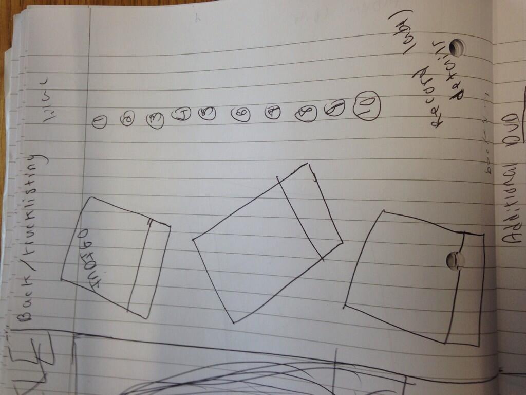
I drew up a final digipak design, as I have changed my ideas and wanted to visually document this so I can refer to it when we shoot during half term. I broke down my panels to list in detail what I wanted for them and also decided on the outfits that I wanted to use. I have decided I will use camera flares and long exposure to link my digipak together, however I will also include my original idea of polaroids in one panel.

Pitch and Feedback


We presented our music artist pitch to the class as part of audience feedback. Our image and audience profile was well received; I feel as if our "ignoring audience feedback" was justified, like our teacher said it needed to be if we choose to not take something into consideration, as both our brief and audience profile are supposed to target females specifically.

We understand that our music video planning is not finished (we have been focusing more on digipaks designs at this moment) but have storyboarded a portion of our music video and discussed our ideas in more detail since constructing our pitch, feeling ourselves that we were struggling with the detail of our ideas. Looking at the lyrics of our chosen track and simply brainstorming what visuals come to mind is something that we did not consider and plan to do to help us with construction.

Overall, I am happy with our audience feedback. Our class understood the link between the genre we have chosen and the image we have constructed  They also agreed with removing the background of our logo to make it simple and more practical to use on marketing products.


Sunday, 20 October 2013

Journal - Digipak Checklist

Below is the list of things that we will need for digipak shoot.

Actors: It will only be myself and my partner at the shoot as I am going to be the model and her the photographer.

Equipment and props: We have already picked out outfits that we can use, but we will also need a tripod, the camera, our prop cameras (a polaroid camera and a Diana F camera) and a torch in order to us to do long exposure.

Location list: We plan to mainly shoot at Ceren's house but to give our photos a more urban feel, we will also shoot at Wrotham Park.

Shooting schedule: We plan to shoot sometime during half term.


Friday, 18 October 2013

Journal - Music Video Storyboard

We have begun the first draft of storyboards for our music video. We only had a few, rough ideas for different parts of the song so it was helpful to sit down and discuss the visuals in detail. We have so far storyboarded the visuals for the first 30 seconds of our song.


We discussed opening our music video by showing our artist's name (Isla) and the song title (Youth Knows No Pain) over a shot of London. This gives us a chance to incorporate our logo and reflect our artist's background immediately; we can also line up the timing of the fade in and fade out of the text to the swiping like sounds in the song, linking with Goodwin's analysis.


We also want to include a establishing shot of London, for iconography, but plan to speed the footage up to go with the music.


We have tried to include close-ups of our artist to reflect Goodwin's analysis but also want to include shots of Isla and her friends to link in with the song title and upbeat vibe.

Polaroid photos are going to be  reoccurring feature in our music video because they are quite artsy; the video is going to be constructed around Isla taking photos on a day out with her friends. We will cut between shots of Isla singing with these polaroids around her to showing the actual day where these polaroids were taken.


Thursday, 17 October 2013

Journal - Digipak Complications

Due to the rainy weather and conflicting schedules on the day of our digipak shoot, we could not take the photos that we wanted to. It has been difficult to find a day which we are both free however we are confident that we can take the majority of our shoot during half term. We already have a production plan that includes outfits and props along with shot types; the majority of our photos are going to be inside in Isla's room, but some others will be around her neighbourhood. I have several rough drawings of designs for my digipak but plan to sketch a detailed, final one next lesson.

For the album cover, I previously planned to include polaroids -- and I still plan to experiment with this to see what it looks like -- but I am conscious of the fact that having two different photos for one album cover might not look very good. It would also mean that I'd have to use a background that didn't distract from the polaroids, which would be the main focus.

In case this does not work for the album cover, I'd like to use a close-up to bring the focus in on her hair and make-up. These are some of the album covers I have been looking at for inspiration. I particularly like the use of lighting orbs here and think that it is something I could use for mine, especially considering that I plan to use long exposure.


These covers have the artist's face as the main focus, with either a close-up or a mid shot, but also rely on fashion and make-up to construct the image.

I would still like to include Polaroid photos of my artist with the tracklisting and/or inside my digipak, but I am conscious of the presence of polaroids in our music video and the issue of a background. Whether the photos inside my digipak are in polaroid form or not, I know they will only consist of shots of Isla. The particular shots that I have in mind for these include a long/mid shot of Isla against a red postbox, posing with a Diana F camera and also drawing out shapes or words -- particularly our logo or album title-- using long exposure.

Journal - CD

I experimented with the design for our CD. I tried having the CD mostly blank - with the exception of our logo and her name -- with a patterned, galaxy background. I chose the purple galaxy background because I thought it was more girly, though I also experimented with a more orangey one. I used the Jenna Sue from dafont.com because it looks artistic and handwritten; like Isla has handwritten it herself. This has been helpful because it has allowed me to see my ideas visually; I originally wanted a floral disc, like my partner, but thought that would be difficult to put a logo over.

When editing our digipak in full, I would like to have an image of Isla underneath the CD.My partner's first draft.

This is my partner's disc design:


My first draft of my disc design:


Wednesday, 16 October 2013

Journal - Outfit Choices

Fashion is a big part of our image so it's important that the clothes we dress our artist in reflect the image we want. These clothes are for our digipak shoot but we might use some of them for our music video also.

Whilst we don't want our look to be eccentric (like Lady Gaga or Katy Perry), we have chosen clothes that are quite bright or patterned so it's not boring. The aim is for our clothes to look more high street, therefore reflecting current trends and styles.

Here are some of the clothes we've chosen:

Seeing as I am considering for our digipak to have a galaxy, starry theme throughout -- this dress fits the theme really well.

A floral pattern is also a possibility for our digipak, considering our logo also had a floral theme, so I found some floral hair accessories that could be good to wear.


Journal - Production Log

We plan to shoot the first photos for our digipak tomorrow. After creating an initial template, we feel ready to take photos. My album cover will feature two photos (possibly stylised to look like polaroid): one of them a close-up of our artist's face and the other a mid shot of her. I also plan to take some long exposure photos to see if they could work for my album cover, however am also considering this for my track listing too. We are taking them at Ceren's (my partner) house.


For the back of album, I would like to have a collage like presentation of polaroids and so will need to take photos for those. If the long exposure turns out correctly, I hope to use it for the polaroids on the back cover band spell out our artist's names. I want these photos to have a candid feel, e.g in a outside area or in her room as opposed to a studio. The polaroids will be on the left with the tracklisting going down in a column on the right; I would like to use a calligraphy/handwritten font, such as the ones below, for the tracklisting.


http://filterrendertalent.files.wordpress.com/2013/01/circumnavigate-album-cover-back-with-track-listing.jpg?w=640&h=640 

To link our digipak together, I will have the same background and colour scheme throughout. I originally wanted a photo with a floral theme -- similar to one we used in our logo -- but it makes any font printed on it difficult to read which won't be practical for the back of the album where we will write our tracklisting. I also like the galaxy backgrounds but am worried that it might look too dark on a digipak and would be difficult to recreate.


 The album cover of the digipak are our main focus for tomorrow's shoot.

Tuesday, 15 October 2013

Journal - Verbal Digipak Discussion

Below is the verbal brainstorm my group member and I had, where we decided/discussed our separate digipak ideas. I want to use polaroids on my album cover, though am still debating whether it will be practical for the album cover as it means I will have to use a background that links in with my chosen image and not take any attention away from the polaroids [which I believe could be difficult].  I attempted to look for an appropriate background by looking online for inspiration, debating between a floral theme or a galaxy theme.

I have also given some thought to the content of the photos; they will mostly be close-ups and mid-shots to keep the focus on our artist and her image. For the tracklisting, I am debating a collage of polaroids. I have decided that my digipak will have two CD's, which will take up two of my sixth panels.

Monday, 14 October 2013

Logo (2)

After revisiting our logo during the making of our pitch, we decided that we want to change it. We both agreed that the background was too much and would make it difficult to put on an album cover; digipaks have to all link together and a different background from our logo would disrupt this. The butterfly and the font would be quite simple as we can make the background transparent on photoshop.

The first draft of our logo: The background from our first draft was complimented so we have kept it as a background we could consider for our digipak.


Our redesigned logo below:


Survey Feedback

After collecting the results from our survey, I have selected responses from the people who fall into our target audience -- females, aged between 16 - 26.

The response has so far been positive, though our survey is still open to more feedback.


A common response to our brief was that the inspiration that we took from Lana Del Rey is more clear than the inspiration for Marina and the Diamonds, but this isn't necessarily something that we're displeased about as we want to be seen as more alternative than pop and feel like Lana Del Rey is.

Our survey has also helped us with ideas for our music video; they gave a list of conventions that they thought needed to be present in a indie-pop music video and so this is something we'll keep in mind when storyboarding. 


The sample understood that our target audience is females but did criticise that the pink floral theme may make it too girly at points. To change this, we can use a different theme for future use but again, we're not displeased that they thought it was girly because we wanted our target audience of females to be reflected. Our audience profile/brief have been received positively, with our sample agreeing that both it applies to them and makes sense.


Artist Pitch


As a part of audience feedback, we grouped together all of our research to present to the class - this is important as they can give their opinions on if our work so far is appropriate. We are yet to present this to the class. It also meant that we revisited all of our previous research which is important as we've now started to brainstorm ideas for both digipaks and music videos so we'll know that we have to keep certain things in mind.

Thursday, 10 October 2013

Blog Feedback

The main point in my blog feedback was to contextualise my posts; for example, instead of just uploading the work; I need to post why I did it, what I learnt/the impact it had. I have since revisited my posts and done this.

Another goal is to constantly track/document my progress, even if it means photographing written brainstorms or recording conversations to avoid a sudden jump in my progress that isn't explained.

Wednesday, 9 October 2013

Digipak Pre-production

We have started to plan the design for our digipak in detail. We included art and photography as the interests for both our artist and target audience and want to include this artistic, alternative element in our digipak and so have decided that we want our digipak to mirror a scrapbook. We want to incorporate Polaroid photos of our artist as the photoshoot in our digipak; these will keep Isla as the main focus and market her yet also provide a vintage, artistic vibe. This also lends an intimate, personal feel to our digipak which could be a selling point. I also want to use long exposure for my album cover to spell out her name.

\


We know that we want several outfit changes throughout our photoshoot to sell Isla's image and fashion, as that is a main selling point of a female artist. We are in the process of deciding these outfits but know that we will have to include current trends and accessories to reflect our target audience.

I would like the tracklisting to be written in a calligraphy type font, so it looks like Isla has written it itself and emphasises how personal the digipak should be. I am also considering long exposure to be present in the digipak because it looks artistic and can be used to spell out the album title or artist.

From analysing other digipaks, an additional disc is a re-occuring factor because it offers more than a normal CD and so we have decided to also do this. We have yet to decide what our additional disc will be but a DVD of exclusive behind-the-scenes or concert footage is a consideration. Both discs will feature our logo on it.


We know that we want several outfit changes throughout our photoshoot to sell Isla's
image and fashion, as that is a main selling point of a female artist. We are in the process of deciding these outfits but know that we will have to include current trends and accessories to reflect our target audience.

Tuesday, 8 October 2013

Logo

We have designed a logo for our artist. We wanted our logo to have a symbol that would be easy to recognise but would also reflect our target audience and artistic vibe. We decided on a butterfly with the same floral print we have used throughout to link everything our artist does together. We have also decided to market Isla on her first name more than her full name.

I am happy with our logo; I think that it looks artistic but also simple. It was important for us to use a font that resembled calligraphy so that it looks like she had written it herself, like a signature, which adds to this intimate, personal feel that we want both our digipak and music video to have. I feel like the butterfly and font could easily be put on an album, whether it's on a physical CD or the cover.

However, we will present this to members of our target audience to see if we get positive feedback.


Thursday, 3 October 2013

Audience Survey

In order to find out whether our current audience research is accurate, we created an online survey to document the responses of a sample group of our target audience. Our target audience is females aged between 16-26 and we are marketing  female indie-pop solo artist.

We are currently awaiting for a substantial amount of feedback on our survey.

Create your free online surveys with SurveyMonkey , the world's leading questionnaire tool.

Wednesday, 2 October 2013

Green Screen Digipak Analysis

As part of my digipak research, I analysed a Florence and the Machine digipak, referencing both the conventions of a digipak in general but also genre conventions. I had previously analyzed digipaks but focused on this one in detail because it combined alternative pop characteristics with digipak characteristics.


This was the first time that I used green screen independently and so it helped further not just my media skills but knowledge of Final Cut Pro. I'd never converted files to DV's before or used any green screen tools before. After researching how to do it online and mirroring that, it was easier than I expected and has provided me with a more creative form of presentation that I hope to use often.